


The volatility indices for US and European equities currently exhibit a wide gap. In response, we take a look at the relation of these two indices over the last few years. Without diving deeper into the indices compositions or forward curves, we want to find out, which influence the current volatility environment might have on equity markets.
Equity markets on this side and the other side of the Atlantic did not move identically during the first half of 2015 which is over in a few days. The first quarter showed a strong outperformance of Europe compared to the US. Depending on the stock indices you prefer, Europe beat the US by between 14% and 22%. In the second quarter, the ranking changed. The US is currently between 1% and 6% in front of Europe.
Analyzing the volatility environment for both regions, we find a wide gap. The most important volatility index, or so called “fear indicator”, in the US stands at low levels. The average figure since the start of the year is 20% below its five year average. On the opposite side of the ocean, the comparable volatility index is 20% above its five year average, and since the start of the year remains exactly on the five year mean.
More interesting than comparing each index value with its past, is a comparison of both indices. The difference between the volatility index for Europe and the one for the US, measured as a 1-month average, is the highest over a five year period.
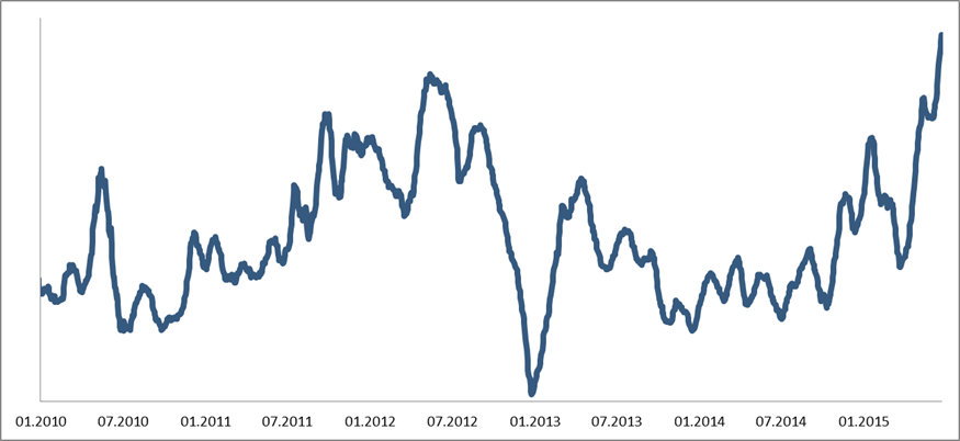
Chart 1: The chart shows the monthly average of the difference between the volatility index for Europe and the volatility index for the US. Since 2010, the figure was never higher than it is currently.
It is reasonable to mention that the volatility difference over the last five years was constantly positive. It means the volatility index for European equities was always above its US peer.
We calculate how both equity markets reacted depending on the then prevailing volatility difference in the past. For this purpose, we measured this volatility difference at month end and computed the returns of both equity market indices for the following three months.
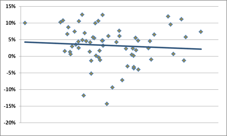
Chart 2: Each point in the scatter plot shows the return of the US stock market over three months, depending on the volatility difference at the beginning of this time span. The x axis represents the volatility differences in ascending order. The trend line unveils a slightly negative relation. The return of US equities over the next three months is the lower, the higher the volatility difference at the beginning of this three month period.
The scatter plots reveal that the US equity market delivers a lower return over three months, the higher the volatility difference is at the beginning of the period (chart 2). Quite the opposite holds for the European equity market (chart 3). Its three month return increases with increasing volatility difference. The outperformance generated by European equities against their US peers also increases with higher volatility differences (chart 4). In simple terms, an investment into the European equity market delivers positive returns over a three month horizon when the volatility difference is high. The higher it is, the more return is generated on average. It also means Europe outpaces the US in those three month periods.
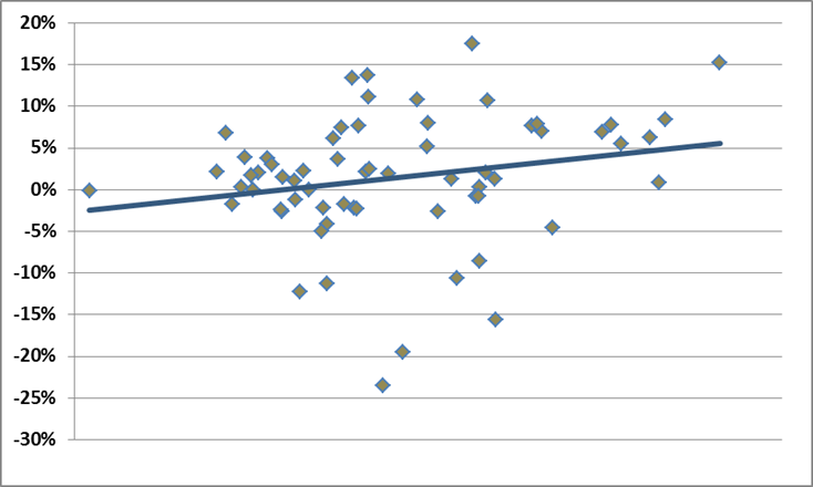
Chart 3: Each point in the scatter plot shows the return of the European stock market over three months, depending on the volatility difference at the beginning of this time span. The x axis represents the volatility differences in ascending order. The trend line unveils a positive relation. The return of European equities over the next three months is higher, the higher the volatility difference at the beginning of this three month period.
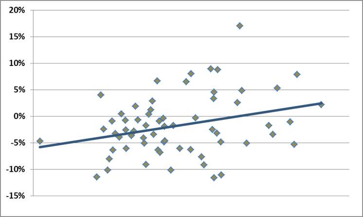
Chart 4: Each point in the scatter plot shows the outperformance of the European stock market against the US market over three months, depending on the volatility difference at the beginning of this time span. The x axis represents the volatility differences in ascending order. The trend line unveils a positive relation. The outperformance of European equities over the next three months is higher, the higher the volatility difference at the beginning of this three month period.
In the scatter plots you can obviously recognize wide variation around the trend lines. More exciting than focusing on the (probably weak) statistical link between volatility differences and average three month returns, is a look at the bigger picture.
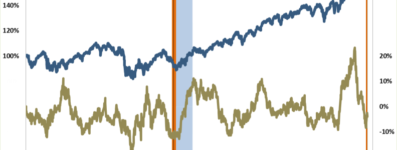
Chart 5 exhibits only one other period of a similar extreme volatility difference over the last five years. Back then, in May/June 2012, the end of this high volatility difference environment marked the bottom for equity markets. Equities in Europe and in the US started a clear upwards trend (blue line). Europe outperformed the US over the next three months significantly (golden line).

Chart 5: The blue line is a simulated passive strategy which is constantly invested in Europe and the US with equal weights (lhs). The golden line displays the outperformance of European equities against US equities over three month periods (rhs). The orange colored areas highlight the current period with extremely high volatility differences and the last time the figure was on a similarly high level (May 2012). The three month period after the high volatility difference environment ended in summer 2012 is marked by the light blue range.
Admittedly, five years are not a long horizon, and finding just one comparable other period with this extremely high volatility differences is sparse, of course. Still, there is reason to compare the current situation with the one back in Mid-2012. At that time, Greece dissolved the parliament and new elections were announced. During these days, the volatility difference figure reached its high.
The current volatility environment could represent the formation of an equity market bottom that directly translates into a new upward trend. All scenarios for Greece, including a default and the Grexit have been publicly discussed as potential outcomes by the relevant persons involved, for days now. The scenarios should already be priced into stocks. The actual occurrence of such a negative scenario can bring short-term fluctuations but does not have to introduce or confirm a negative trend for equities. At least for the European market the indications, also compared to the US, look quite positive based on the parallels with summer 2012.